검색결과 리스트
프로젝트에 해당되는 글 12건
- 2015.08.13 [프로젝트] read more
- 2009.09.05 [작업] Complexity Maps 2
- 2009.08.18 [작업] DATA FLOW 3
- 2009.08.18 [작업] D49
- 2009.08.17 [작업] 성남디자인페스티벌
- 2008.07.15 Complexity Maps 4. Marcos Weskamp - News Map / Social Circles
- 2008.07.08 Christian Nold 1
- 2008.06.29 Complexity Maps 3. Thomas Laureyssens - Pedestrian Levitation
- 2008.06.29 Complexity Maps 2. Mark Lombardi - World finance corpotation and associates
- 2008.06.29 Complexity Maps 1. They Rule
글
[프로젝트] read more

방학동안 CT내 아이디어동아리 (?) 프리스텝에서 진행하던 개인프로젝트의 파이널 발표날
파이널이라고해봤자 완성은 아니고 학기중 수업으로 치면 겨우 이제 Proposal 정도의 단계까지만 진행된 정도
책 읽는 행위에 대한 디자인 프로젝트.
하드웨어는 아두이노, makeymakey, 소프트웨어는 Max/msp로 1차 프로토타이핑을 진행했는데
조금더 구체화되는 과정에서 여러가지 기술적인 스터디가 더 필요하게되서 그 과정과 공부한 자료들을 블로그에 차츰 기록해둘 예정이다
프리스텝에서는 5-6주간 본인의 아이디어를 Ideation-Research-Proposal-Prototyping-Presentation 이렇게 한 싸이클로 돌리면서 서로 진행사항 공유하며 피드백을 주고받으며 발전시켜나가는 방식으로 여름 프로젝트를 진행중이다.
방학때 두번 정도 사이클을 돌려보고 싶었는데 각자 연구 및 여가(?) 스케쥴 등등으로 좀 많이 루즈해져서 한 번 밖에 못할듯하지만 , 어쨋든 매주에 한번이라도 공유해야하니 미미하지만 프로젝트가 조금이나마 진척이 된다는 것, 각자 다른 전공의 멤버들에게서 다양한 관점으로 피드백을 주고 받을 수 있다는 것, 그리고 약간의 재료비 및 다과비가 지원되는 것. 그리고 수업이 아니다보니 교수님의 압박 없이 스스로 포인트를 조절할수있는게 좋다.
설정
트랙백
댓글
글
[작업] Complexity Maps

i. context
Connecting the visible and the invisible
In the last two decades Information Visualisation has emerged as one of the most important techniques for managing data in our present knowledge society, due to its ability to make the complex – accessible, the invisible – visible, and the intangible – palpable. Traditional forms of mapping and representation of cities seem to be inadequate in representing urban space as a living organism.
The complexity of city flows (both tangibles and intangibles) require subtle tools that can visualise complex phenomena without breaking them up, tools that depict qualities of a system which would otherwise not be perceptible and collective visions capable of defi ning and structuring the spaces where we interact.
In this way, the new language of diagrams and maps can be seen as a liminal interface between knowledge and experience, rather than a mere description of reality. This new language constructs visual models that connect the physical realm of cities and buildings with the invisible world of communication, social networks and human activity. The potential of this new language is to create a shared visual vocabulary that goes beyond just representing systems but also enables the pinpointing of critical pivot points that allow interventions into the system.
The Complexity maps workshop had three broad aims. First, the development of an appropriate way of gathering local information in a consensual way with local stake holders. Second, to produce visualisations that could create new insights into the local dynamics of the site. Third, the creation of new methodological models for the Information Visualisation discipline as a whole.
ii.theme
Visions through perceptions
Urban policies involve different administrative bodies which are often not co-ordinated and deal with a wide remit from environmental policy to infrastructure, from social integration to public security. The institutional role of the Urban Center Metropolitano of Turin, is to ease the interaction and the decision making process between these different city administration entities, through building scenarios of the future transformation of Turin. The Urban Center were designated as the workshop local client for this project and suggested the target site, Stura Park, in the northern periphery of Turin as one of the last large empty sites in Turin and a location where they predict intense future change (fi g. 2, 3, 4, 5, 6). In collaboration with the local government they had been creating strategic plans for Stura Park which included a Golf Course and the building of two nearby Metro stops (fi g. 7). Despite these plans, the Urban Centre had little local knowledge of the site and no contact with local people or organisations. In addition, the Urban Centre had some doubts about the proposal of a Golf Course and wished to gain a much better understanding of local opinions and interactions of local actors.
The aim of the workshop was to identify people’s thoughts, issues and desires and to see how visualisation could be integrated in political and cultural process, providing new elements for a strategic vision of the future transformations of the target area.
]
Project brief
1. Represent local people’s perception;
2. Create a tool for discussing future change;
3. Develop a methodological critique of the Urban Centre’s current approaches to local sites.
Stura Park is an unmanaged and overgrown postindustrial wasteland bounded by the bank of the river Stura on one side and conduit roads that lead towards the centre of Turin in one direction and Milan in the other (fi g. 8).
What few people seemed to know or acknowledge before proposing this target site for the project, was that the Stura Park is considered by researchers to be the biggest heroin distribution ‘centre’ in Europe.
iii. process
Design Ethnography + Analytical Urbanism & Information Design
The conceptual approach of this workshop used Actor-Network Theory as articulated by John Law and Bruno Latour, translated into a practical form.
The method tried to analyse the project area as a complex entity constituted by the relationship between people (a range of competing actors with different interests), material (places, objects and fl ows) and semiotic entities (ideas and concepts). By seeking connections, analysing relations and describing the systems, the students perceived the area as an intertwined network and assumed to collect the points of view of many actors particularly and citizens.
The students worked in small groups on five topics, strongly linked with the other Summer School workshops design themes, trying to answer and questioning
to the following issues:
_Mobility – Where do people want to get to and how do we get there?
How is mobility affecting the local sense of place and quality of life?
_History and Future – What is this place? What are the current ideas about the history and future of this place?
What do local people think will happen?
_People – Who lives there and where and why do they meet?
Who are the different groups of people who use and/or own this place?
_Security and Insecurity – What does security or insecurity means in the local context?
What are the local fears and dangers?
_Environment – How are the local people engaged with their surroundings?
What effect does the environment have?
The week long workshop was split into two phases. In the fi rst part, local people were interviewed and data collected on the project site in Turin, while the
second part was focused on synthesizing, analysing and visualising the information collected (fi g. 9).
Design Ethnography:
looking as an outsider, thinking as an insider
The fi rst three days were spent interviewing more than 100 local people, considering them as experts on the local context. A large number and variety of stakeholders were interviewed (local government, environmental agency, area planners, local shopkeepers, residents, gardeners, drug addicts) (fi g. 10, 11, 12): but students were well-aware that quality shall be preferred over quantity. Moreover, the students refl ected on their own thoughts and perceptions since they, as outsiders, could perceive the area as a “whole”.
In addition tests of soil and water quality were taken from the target area since there were some concerns about possible environmental pollution.
Analytical Urbanism and Information Design:
looking for patterns to narrate a meaningful story
The second phase started with the analysis of the huge amount of data collected (fi g. 13, 14, 15, 16). Different qualitative approaches, such as Discourse Analysis, were introduced to sieve and cluster information. Local and national newspaper databases were analysed, as well as some background demographic reports. The key activity was fi nding patterns and connections between offi cial data and the ones collected on field. At this stage the initial fi ndings were shared among the student groups and a large number of common issues emerged from the different starting themes.
This part of the work explored how to visualise and communicate the fi ndings: from a descriptive and analytic understanding of the forces that shape the local context, to developing a visual narrative that uncovers the local urban and political reality.
iv. results
A design system for local informational empowerment
Each project group developed their own map with its own results:
Mobility Group
History/Future group
People group
Security/Insecurity group
Environment group
This group combined physical pollution testing with qualitative analysis of the stakeholders’ perception of the local environment.
These methods lead them to conceptualise the site as a space where the local actors of government administration, media as well as local citizens are in confl ict.
The main conclusion of this group was that the fear triggered by the media representation of the area as “Drug Park” overshadows all the local environmental
issues such as the new allotments where people are growing food in possibly heavily polluted soil.
Participants group A: Beatrice Lerma, Luca Masud, Francesca Vargiu.
Participants group B: Hanna Kim, Hyebin Park.
Conclusion
The workshop highlighted a unique series of complex local dynamics which began with the urban readjustments related to the Turin Olympics that have turned the Park into what is today known as the European capital of heroin dealing. Interestingly, after the workshop, none of the students thought that there were any external political or design interventions that could improve the local situations but that the local community had to be supported in creating their own solutions to these issues. In fact all the groups identified that since the 1960’s external interventions had been disrupting a local equilibrium between the different actors.
Starting with the central concept of the local network of experts, the Community Mapping project revealed the dynamics behind the physical location of Stura Park and made these dynamics visible and discussable. The workshop articulated a new concept of Embedded Design, which formulates a vision of the designer that becomes literally embedded with the social and political microcosm, he or she deals with. The designer needs to identify with the local context through full mental, bodily and emotional involvement. The designer’s role shifts to becoming a local expert who, just like other local experts, is involved in problem identifi cation, communication and problem intervention. A new role for the design discipline seems to emerge: the possibility to intervene at the informational level into the dynamic of a local system and to create empowering knowledge resources that enable collaboration between institutions, organisations and citizens.
teaching staff
project leader
Christian Nold
Designer, UK
project leader assistant
Jim Sergers
City Mine(d), Brussels, Barcelona and London
metadesign leader
Paolo Ciuccarelli
Associate Professor, INDACO Department,
Politecnico di Milano, Italy
metadesign leader assistants
Donato Ricci
PhD candidate in Industrial Design and Multimedia
Communication, INDACO Department,
Politecnico di Milano, Italy
Gaia Scagnetti
PhD INDACO Department, Politecnico di Milano, Italy
local client
Antonio De Rossi
Urban Center Metropolitano, City of Torino, Italy
이 글은 스프링노트에서 작성되었습니다.
'프로젝트 > 2009 TORINO workshop' 카테고리의 다른 글
| Complexity Maps 4. Marcos Weskamp - News Map / Social Circles (0) | 2008.07.15 |
|---|---|
| Christian Nold (1) | 2008.07.08 |
| Complexity Maps 3. Thomas Laureyssens - Pedestrian Levitation (0) | 2008.06.29 |
| Complexity Maps 2. Mark Lombardi - World finance corpotation and associates (0) | 2008.06.29 |
| Complexity Maps 1. They Rule (0) | 2008.06.29 |
설정
트랙백
댓글
글
[작업] DATA FLOW
독일 Gestalten 출판사에서 발행한 DATA FLOW의 후속편 DATA FLOW 2권에 인포메이션 그래픽과 포스터 몇작품이 실리게 되었다.
캐캐묵은 폴더를 열어 먼지를 털어내고 광을 내서 보내야 한다.
왠지 설레..ㅎㅇㅎㅇ
Data Flow
Visualising Information in Graphic Design
Editors: R. Klanten, N. Bourquin, S. Ehmann, F. van Heerden, T. Tissot
Language: English
Release: September 2008
Price: € 49,90 / $ 78,00 / £ 45,00
Format: 24 x 30 cm
Features: 256 pages, full colour, hardcover
ISBN: 978-3-89955-217-1
The application of diagrams extends beyond its classical field of use today. Data Flow charts this development, introduces the expansive scope of innovatively designed diagrams and presents an abundant range of possibilities in visualising data and information. These range from chart-like diagrams such as bar, plot, line diagrams and spider charts, graph-based diagrams including line, matrix, process flow, and molecular diagrams to extremely complex three-dimensional diagrams. Data Flow is an up-to-date survey providing cutting-edge aesthetics and inspirational solutions for designers, and at the same time unlocks a new field of visual codes...
More Info about "Data Flow"
More and more information is being visualised. Diagrams, data and information graphics are utilised wherever increasingly complex elements are present, whether it is in magazines, non-fiction books or business reports, packages or exhibition designs.
Data Flow presents an abundant range of possibilities in visualising data and information. Today, diagrams are being applied beyond their classical fields of use. In addition to archetypical diagrams such as pie charts and histograms, there are manifold types of diagrams developed for use in distinct cases and categories. These range from chart-like diagrams such as bar, plot, line diagrams and spider charts, graph-based diagrams including line, matrix, process flow, and molecular diagrams to extremely complex three-dimensional diagrams.
The more concrete the variables, the more aesthetically elaborate the graphics – sometimes reaching the point of art – the more abstract, the simpler the readability. The abundant examples in Data Flow showcase the various methodologies behind information design with solutions concerning complexity, simplification, readability and the (over)production of information. In addition to the examples shown, the book features explanatory text.
On 256 pages, Data Flow introduces a comprehensive selection of innovatively designed diagrams. This up-to-date survey provides inspiration and concrete solutions for designers, and at the same time unlocks a new field of visual codes.
이 글은 스프링노트에서 작성되었습니다.
'프로젝트' 카테고리의 다른 글
| [작업] D49 (0) | 2009.08.18 |
|---|---|
| [작업] 성남디자인페스티벌 (0) | 2009.08.17 |
설정
트랙백
댓글
글
[작업] D49
![]() 8월 17일 S&D HALL
8월 17일 S&D HALL
Design for Designers
9월 전시를 위한 중간 평가 전시 및 회의
- 문구셋트 새로 제작
- 제본 인쇄 제단 모두 엉망 ㅠㅠ 새로운 출력소 찾을것!
- 어떻게하면 오차에 대한 위험부담을 줄일수 있을까
-
스티커 픽셀 재작업, 주문하기(칼선 가격 문의) 마감:27일
-
전시 준비
각 스티커 크게 출력. 사진 촬영
표지 포스터 출력. 사진 촬영
도우미 구하기
-
Language of Designers
리서치:은어.유머.아이콘.유행
이 글은 스프링노트에서 작성되었습니다.
'프로젝트' 카테고리의 다른 글
| [작업] DATA FLOW (3) | 2009.08.18 |
|---|---|
| [작업] 성남디자인페스티벌 (0) | 2009.08.17 |
설정
트랙백
댓글
글
[작업] 성남디자인페스티벌
니마음을뺏지가 성남디자인페스티벌에 참가합니다.
7월 2일 : 성남디자인페스티벌 아이디어초대전 및 디자인마켓 지원서 제출
7월 21일 : 참가 확정
8월 12일 : 아이디어 초대전 작가 모임 (사당)
8월 16일 : 회의 (카페정글)
![]()
8월 19일 : 아이디어 초대전 전시 최종 계획안 제출
9월 16 - 17일 : 전시 디스플레이
9월 18 - 20일 : 페스티벌
이 글은 스프링노트에서 작성되었습니다.
'프로젝트' 카테고리의 다른 글
| [작업] DATA FLOW (3) | 2009.08.18 |
|---|---|
| [작업] D49 (0) | 2009.08.18 |
설정
트랙백
댓글
글
Complexity Maps 4. Marcos Weskamp - News Map / Social Circles
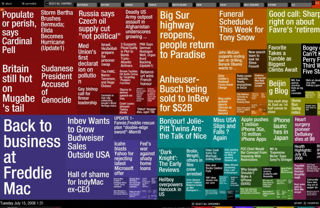
www.marumushi.com/apps/newsmap/newsmap.cfm
각 분야별 뉴스의 가장 중요한 헤드라인을 시각화한 어플리케이션. 각 섹션은 더 최신 기사일 수록 밝은 톤으로, 이슈가 더욱 부각될수록 면적이 더 커짐.
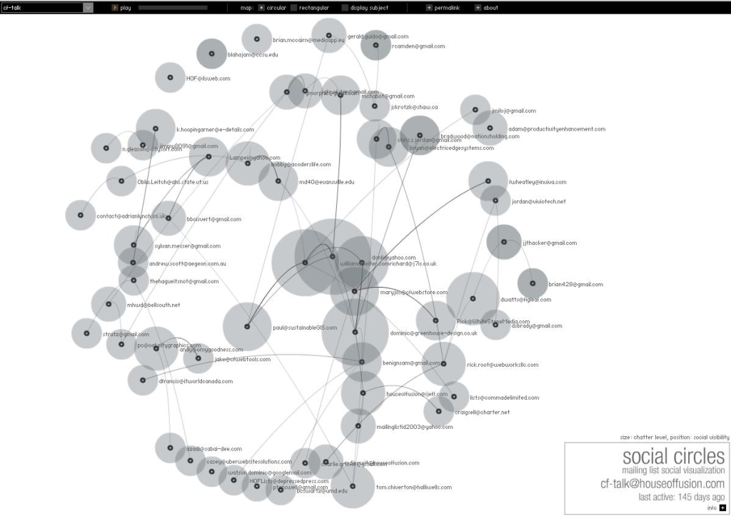
Social Circles
http://www.marumushi.com/apps/socialcircles/index.cfm
메일링 리스트를 통해 사회 네트워크를 시각화한다. 거의 실시간으로 그들이 보내는 메일들간의 관계를 볼수 있다.
Marcos Weskamp
현재 사람들은 정보의 범람 속에서 작업하고 있습니다. 너무나 많은 정보가 있습니다. 우리는 도심의 어디서나 잡지, 광고, TV, 라디오 등을 통해 흘러나오는 정보의 홍수 속에서 인간의 감각을 자극하는 수많은 이미지들을 접하고 있습니다. 인터넷은 매우 훌륭한 커뮤니케이션 도구이지만 매일 지속적으로 과도한 정보를 처리하고 있습니다.
오늘날 인터넷은 새로운 과제를 안고 있습니다. 규제되지 않은 다량의 정보 배포방식을 해결하기 위해서는 대규모 데이터를 체계화, 간소화, 분석할 수 있는 새로운 시각적인 패러다임이 필요합니다. 새로운 UI 필요성도 많은 양의 정보를 처리할 때 등장하는 과제 중의 하나입니다. 경우에 따라 정보를 간단하게 시각적으로 재구성하기만 하면 완전히 새로운 방식으로 정보를 인식할 수 있게 됩니다.
<Macromedia MAX 2005 Korea / 세션 소개>
'프로젝트 > 2009 TORINO workshop' 카테고리의 다른 글
| [작업] Complexity Maps (2) | 2009.09.05 |
|---|---|
| Christian Nold (1) | 2008.07.08 |
| Complexity Maps 3. Thomas Laureyssens - Pedestrian Levitation (0) | 2008.06.29 |
| Complexity Maps 2. Mark Lombardi - World finance corpotation and associates (0) | 2008.06.29 |
| Complexity Maps 1. They Rule (0) | 2008.06.29 |
설정
트랙백
댓글
글
Christian Nold
Christian Nold
Christian Nold is an artist, designer and educator working to develop new participatory models for communal representation. In 2001 he wrote the well received book ‘Mobile Vulgus’, which examined the history of the political crowd and which set the tone for his research into participatory mapping. Since graduating from the Royal College of Art in 2004, Christian has led a number of large scale participatory projects and worked with a team on diverse academic research projects. In particular his ‘Bio Mapping’ project has received large amounts of international publicity and been staged in 16 different countries and over 1500 people have taken part in workshops and exhibitions. These participatory projects have a strong pedagogical basis and grew out of Christian’s formal university teaching. He is currently based at the Bartlett, University College London.
>>>
Concept
Technology is not the neutral, rational instrument that it is portrayed as; instead it appears to be a heady and unstable mix of authoritarian control and anarchic mischief.
My approch is to slip into the gap between these two poles and use it as my medium by combining the freedom offered by the art world with the agency obtainable through design and technology. My aim is to build new tools that reek of possibility and also possible misuse.
The first part of my work is the in-depth research of technological tools in order to unravel their social and political layers. This has so far included the book Mobile Vulgus which scrutinized the mind state and weaponry of the riot policeman. In particular it focused on the futuristic crowd control technologies being developed for use in our streets.
The second part of my practice involves the building of socially constructive, bottom-up tools. These take the form of practical tools such as the Bio Mapping project or the Affect Browser.
I am interested in working with individuals, groups, companies and institutions that are trying to develop new hybrid forms of technology that are socially and economically sustainable.
'프로젝트 > 2009 TORINO workshop' 카테고리의 다른 글
| [작업] Complexity Maps (2) | 2009.09.05 |
|---|---|
| Complexity Maps 4. Marcos Weskamp - News Map / Social Circles (0) | 2008.07.15 |
| Complexity Maps 3. Thomas Laureyssens - Pedestrian Levitation (0) | 2008.06.29 |
| Complexity Maps 2. Mark Lombardi - World finance corpotation and associates (0) | 2008.06.29 |
| Complexity Maps 1. They Rule (0) | 2008.06.29 |
설정
트랙백
댓글
글
Complexity Maps 3. Thomas Laureyssens - Pedestrian Levitation
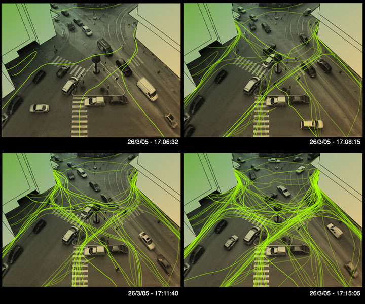
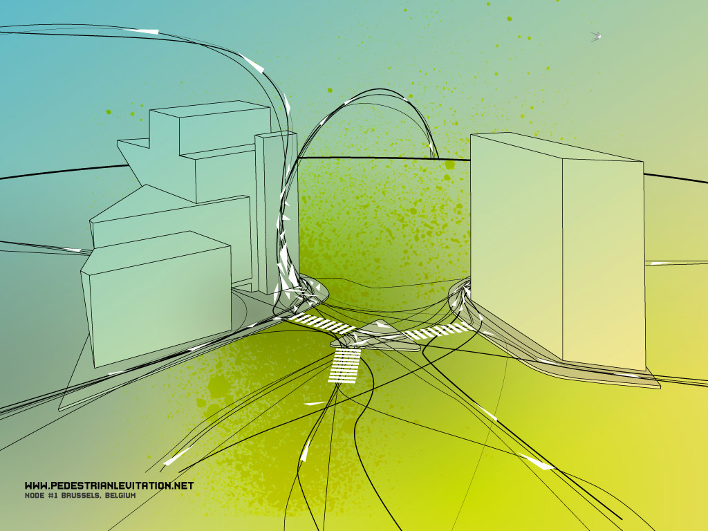
Pedestrian Levitation
www.pedestrianlevitation.net
공공예술(거리예술) 프로젝트, 횡단보도에서 실제 보행자의 움직임 비디오카메라로 녹화하여 시각화하고, 그 데이터로부터 지배적인 방향성을 발견하여 그것을 토대로 가상의 방향성이 있는 삼각형을 실제 현실세계의 도로부터 빌딩 벽까지 이어지도록 배치했다. 이 작업으로 인해 공공장소의 벽이 예술적으로 해석된 아트워크의 캔버스가 될 수도 있으며, 디자인 프로세스로서의 의의도 가지게 된다.
'프로젝트 > 2009 TORINO workshop' 카테고리의 다른 글
| Complexity Maps 4. Marcos Weskamp - News Map / Social Circles (0) | 2008.07.15 |
|---|---|
| Christian Nold (1) | 2008.07.08 |
| Complexity Maps 2. Mark Lombardi - World finance corpotation and associates (0) | 2008.06.29 |
| Complexity Maps 1. They Rule (0) | 2008.06.29 |
| WDC Seoul Membership Orientation (0) | 2008.06.26 |
설정
트랙백
댓글
글
Complexity Maps 2. Mark Lombardi - World finance corpotation and associates
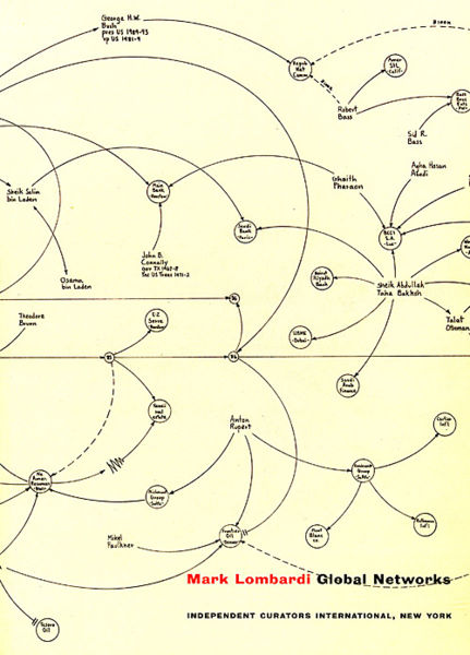
Mark Lombardi
http://www.pierogi2000.com/flatfile/lombardi.html
1994년부터 "narrative structures"라는 금융과 역사적으로 중요한 스캔들에 대한 방대한 데이터를 정리하여 다이어그램으로 표현하여 독자에게 정치,사회,경제적 영향력의 실체와 그 관계를 폭로하는 프로젝트를 해오고 있는 컨셉예술가
컴퓨터 프로그램이 아니라 연필로 직접 드로잉한다
'프로젝트 > 2009 TORINO workshop' 카테고리의 다른 글
| Christian Nold (1) | 2008.07.08 |
|---|---|
| Complexity Maps 3. Thomas Laureyssens - Pedestrian Levitation (0) | 2008.06.29 |
| Complexity Maps 1. They Rule (0) | 2008.06.29 |
| WDC Seoul Membership Orientation (0) | 2008.06.26 |
| [2008] TORINO International summer design school (0) | 2008.06.26 |
설정
트랙백
댓글
글
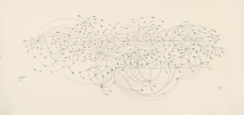
Complexity Maps 1. They Rule
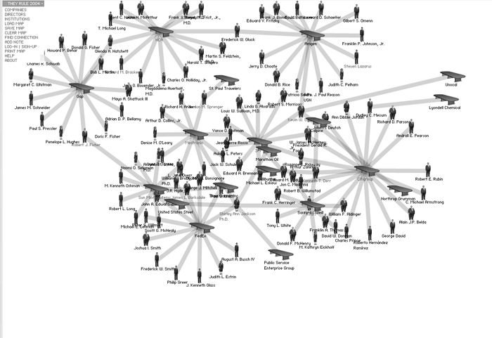
www.theyrule.net
미국 시장 내에서 가장 영향력있는 회사들의 디렉터이자 다른 회사나 위원회에서도 권력을 발휘하고 있는 이들의 관계를 시각화하고 있다. 인터렉션을 가미하여 사용자가 원하는 회사별, 디렉터별로 검색과 데이터 배치가 가능하도록 했으며, 최종 결과물을 저장, 출력도 할 수 있다. 정보가 현실과 100% 일치하지는 않지만 몇년 간 지속적으로 업데이트를 해오고 있으며, 이용자가 직접 코멘트도 남길 수 있다.
- 나름 디렉터들의 모습이 조금씩 다른게 묘미. 뚱뚱하거나, 보통 체격이거나, 말랐거나. :)
- 조직의 구조를 시각화하는게 과제였던 CI 수업 파이널 때 참고가 될 수 있었을텐데 아쉽다.
'프로젝트 > 2009 TORINO workshop' 카테고리의 다른 글
| Christian Nold (1) | 2008.07.08 |
|---|---|
| Complexity Maps 3. Thomas Laureyssens - Pedestrian Levitation (0) | 2008.06.29 |
| Complexity Maps 2. Mark Lombardi - World finance corpotation and associates (0) | 2008.06.29 |
| WDC Seoul Membership Orientation (0) | 2008.06.26 |
| [2008] TORINO International summer design school (0) | 2008.06.26 |

RECENT COMMENT